Digvoice
Digvoice
Digvoice
Due to my interest in the financial world, I took advantage of the free theme exercise and develop Digvoice, an end-to-end billing management SaaS.
The objective is to improve the visual interface and usability that tend to be obsolete in this type of platforms, facilitating its handling and the user consolidation in the digital age.
Duration
Duration
Duration
Duration
One week
Setting
Setting
Setting
Individual student project
Goal
Goal
Goal
Create a computer visual interface to attach documents
The project is focused on the task of digitalization invoices in the cloud, taking into account the premise of having to attach PDF and JPG files. These digital invoices will have the same legal value as a paper one, allowing more safety and efficient storage.
After investigating the user and their context when carrying out the task, learning about this type of procedure and the existing digital solutions, it is defined and ideated how to approach the interface to make it as intuitive as possible.
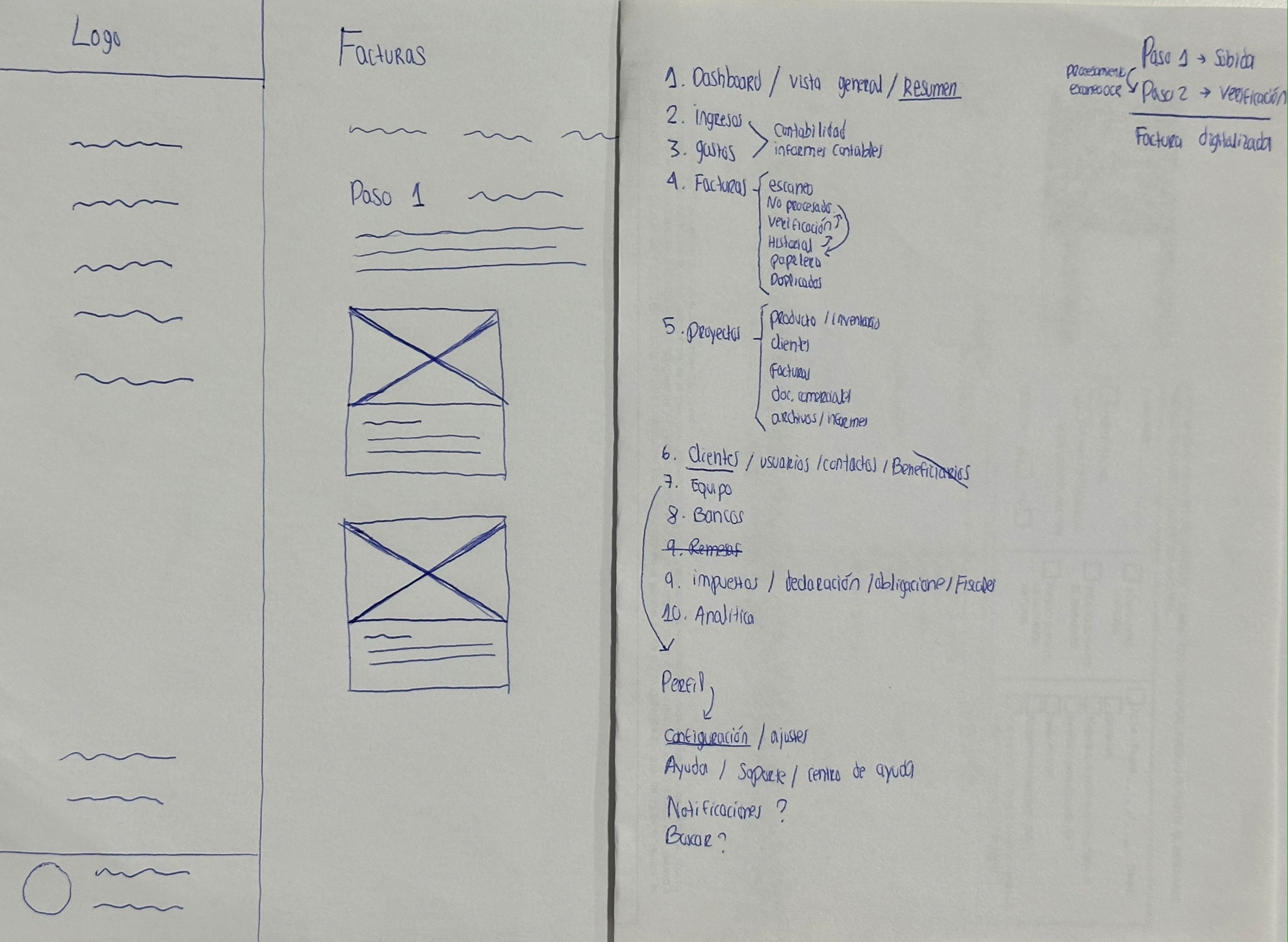
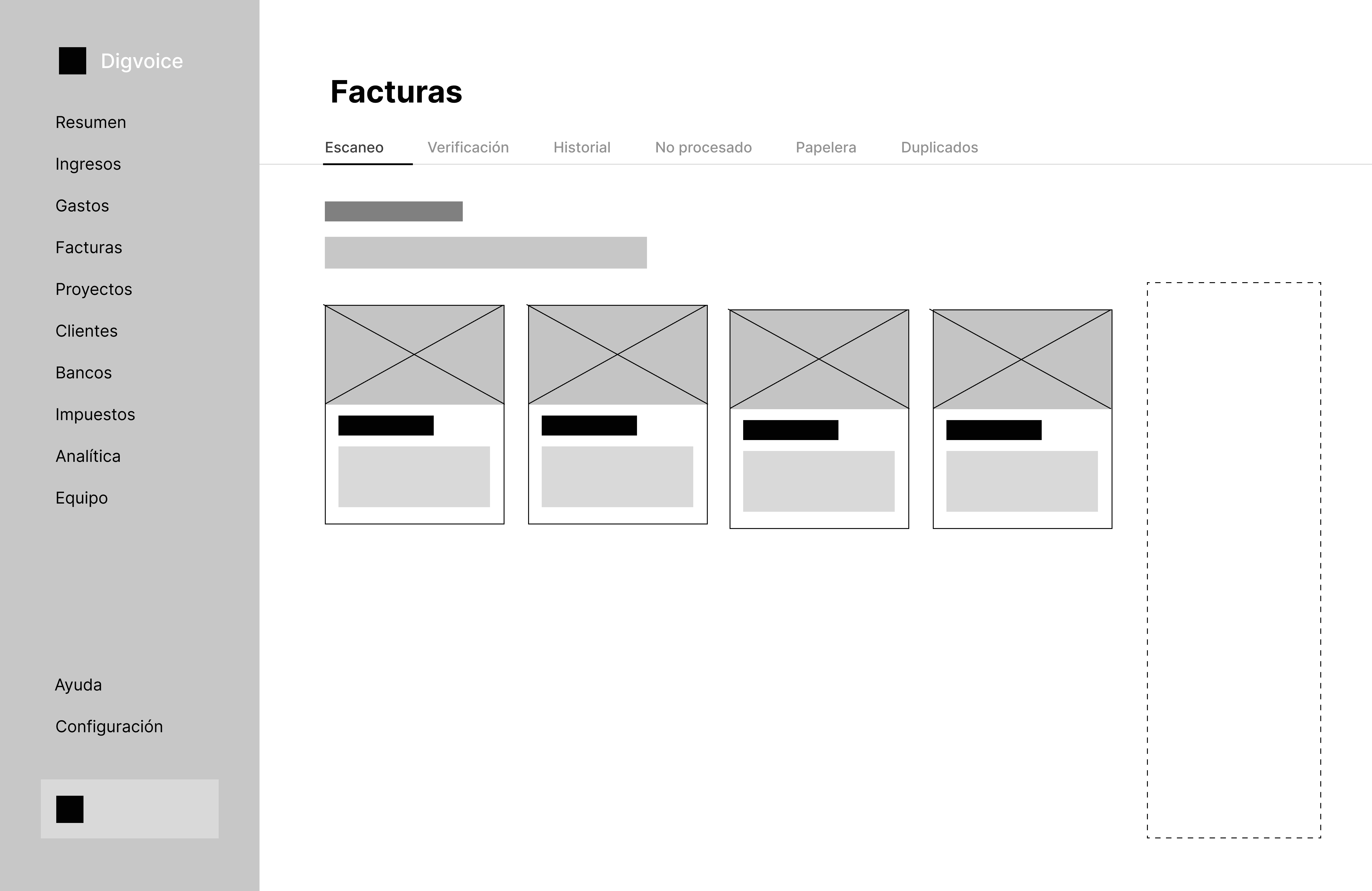
The information architecture and layout work goes through different stages, from paper and pen, digital wireframes, to the most detailed mockup in Figma:
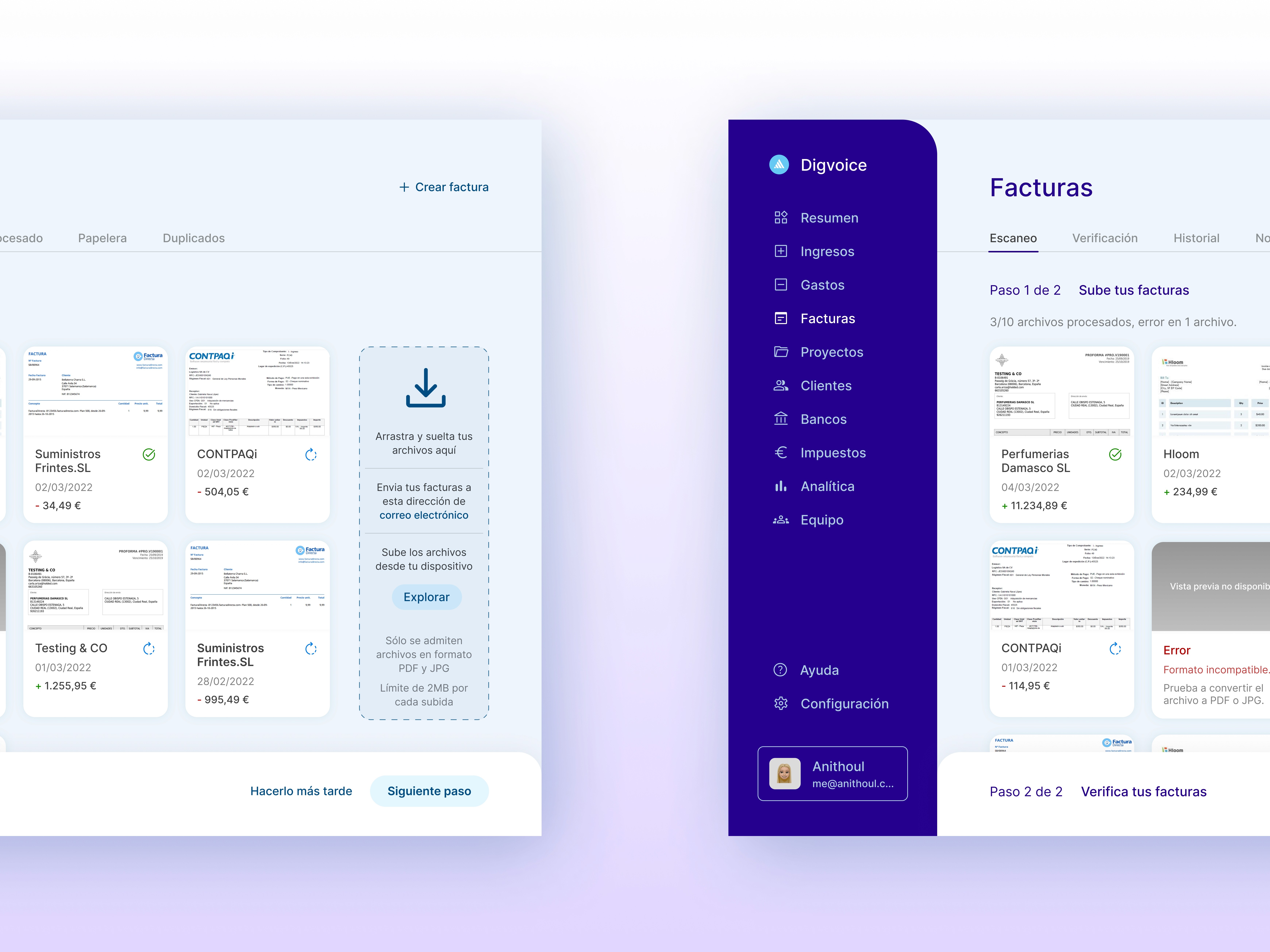
The invoice digitalization process is divided into two steps. The first one, is the upload of the files, which can be done simply by dragging them to the screen, browsing them or sending them to a personalized email. For this last situation, in the case that a person has to send an invoice to the user, they can save that time and have it uploaded directly to the platform.
The project is focused on the task of digitalization invoices in the cloud, taking into account the premise of having to attach PDF and JPG files. These digital invoices will have the same legal value as a paper one, allowing more safety and efficient storage.
After investigating the user and their context when carrying out the task, learning about this type of procedure and the existing digital solutions, it is defined and ideated how to approach the interface to make it as intuitive as possible.
The information architecture and layout work goes through different stages, from paper and pen, digital wireframes, to the most detailed mockup in Figma:
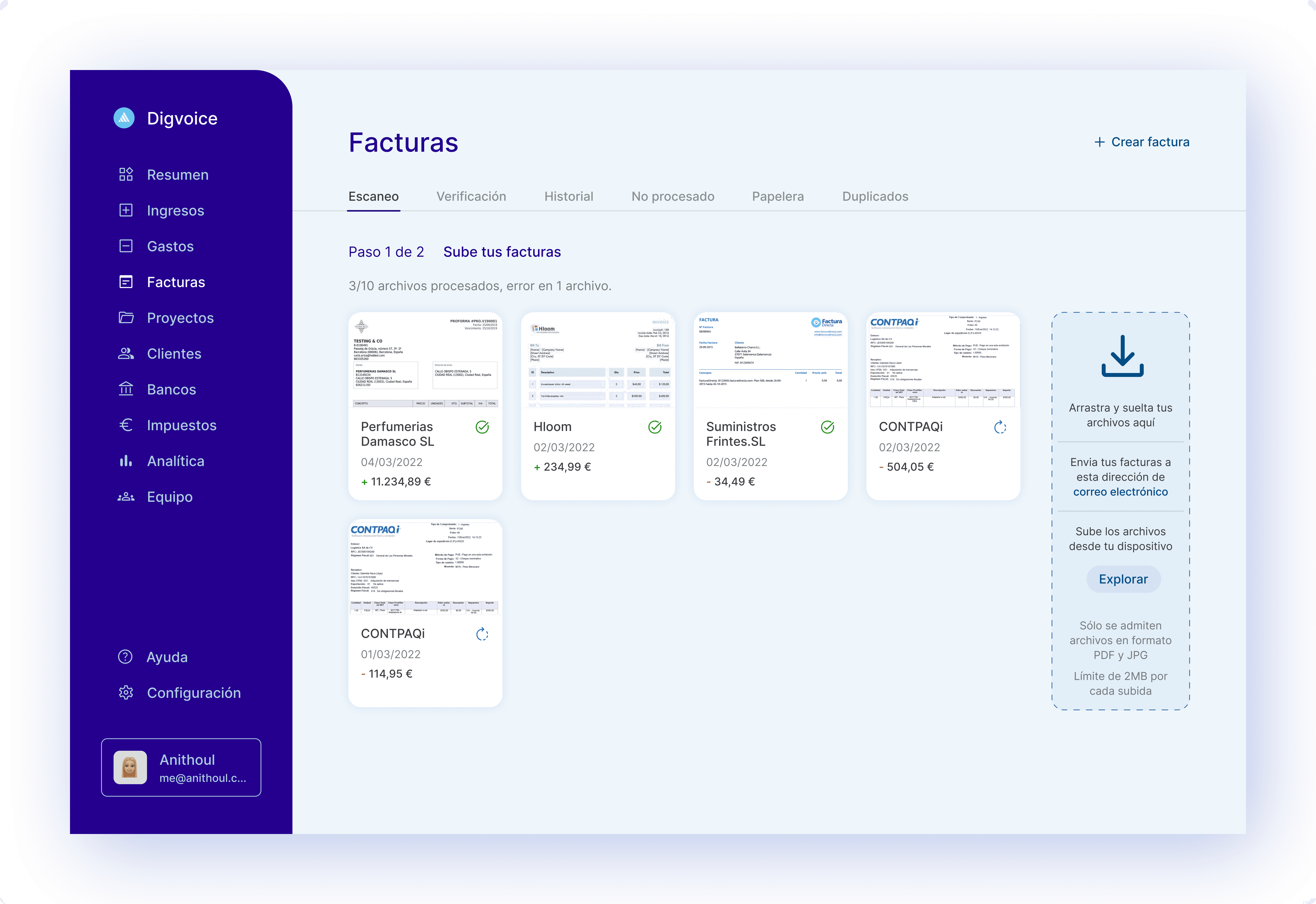
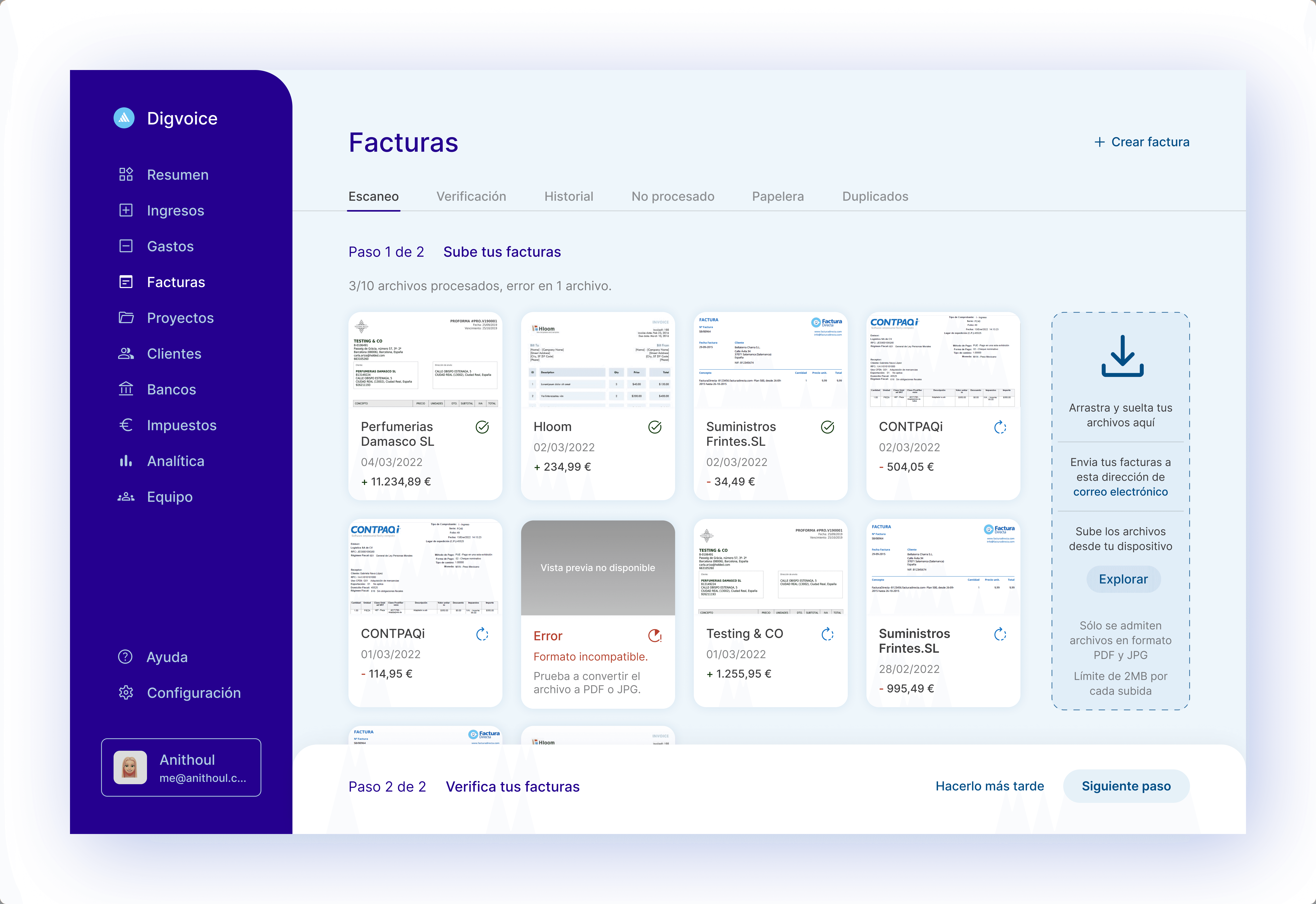
The different states that can occur when performing this upload task are indicated with iconography, color, and informative text messages. With them, the user knows at all time where the process is, and in case of an error, they know what has happened and why, as well as an indication of how to solve it.
When the files are finished processing (OCR scanning), a modal pops up to guide the user to the next step.
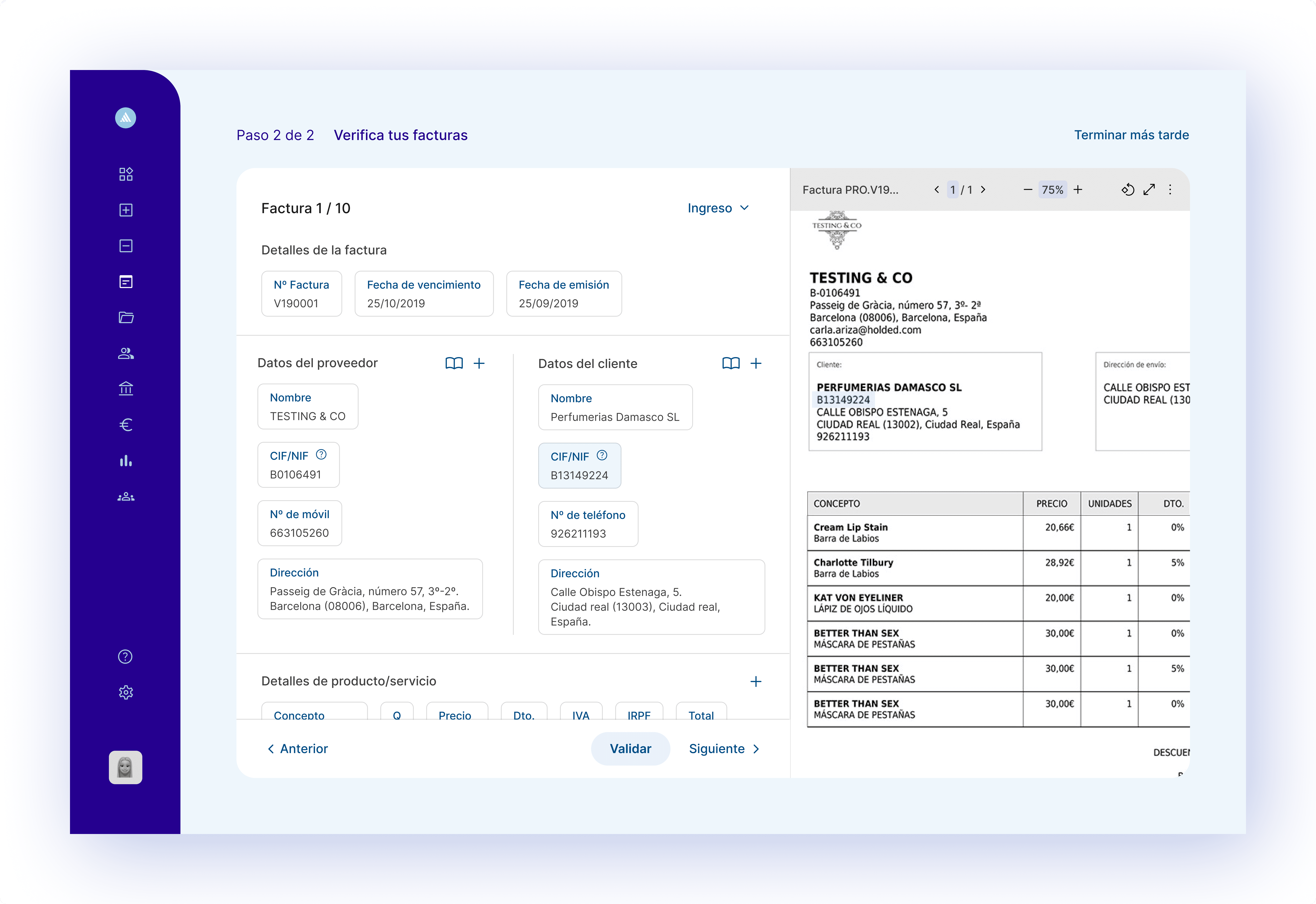
In the second step, the user can inspect the information and verify that everything is in order. When hovering over the data, they will be underlined in the original invoice to be able to compare them quickly, and to modify them you will only have to click on the text box. Both supplier and customer data can be saved in an agenda and speed up the process on future occasions, the system can identify the contact directly. If required, new fields can also be added.
During navigation, the user can adapt the experience to their needs and tastes (and those of the recipient), being able to choose, for example, between several menus.
During navigation, the user can adapt the experience to their needs and tastes (and those of the recipient), being able to choose, for example, between several menus.
During navigation, the user can adapt the experience to their needs and tastes (and those of the recipient), being able to choose, for example, between several menus.
There are two ways to access the functionality, through a permanent section in the nav bar, from which a pop-up pops up after five minutes of searching, a time limit before the user feels frustrated; the other way is through a CTA within a prominent section on the home page.

The functionality designed consists of three simple steps, like a questionnaire, to help quickly find audiovisual content of interest. The final result, once the user feedback has been applied, is as follows:
Finally, the five suggestions that come closest to the filters that have been applied are shown one by one, and as a last option, you can see all the results that fall within those parameters.
The first step of the functionality refers to different types of content to display, the second to emotions and what the user wants the content to convey at that moment, and the third to specific topics. This last step, on the one hand, follows the algorithm to get closer to the users’ taste, and on the other hand, suggests different topics to be able to also get out of it and find new things.
The functionality designed consists of three simple steps, like a questionnaire, to help quickly find audiovisual content of interest. The final result, once the user feedback has been applied, is as follows:
There are two ways to access the functionality, through a permanent section in the nav bar, from which a pop-up pops up after five minutes of searching, a time limit before the user feels frustrated; the other way is through a CTA within a prominent section on the home page.
The first step of the functionality refers to different types of content to display, the second to emotions and what the user wants the content to convey at that moment, and the third to specific topics. This last step, on the one hand, follows the algorithm to get closer to the users’ taste, and on the other hand, suggests different topics to be able to also get out of it and find new things.
Finally, the five suggestions that come closest to the filters that have been applied are shown one by one, and as a last option, you can see all the results that fall within those parameters.
In order to make life easier for people through digital technology, this software will take advantage of the fact that invoices provide reliable accounting data in real time, to centralize financial analysis and management, connecting in turn with the user's bank. Finally, for the automatic management of end-to-end invoicing, the user will have access to those reports provided by the tax agency, speeding up compliance with their tax obligations.
The functionality designed consists of three simple steps, like a questionnaire, to help quickly find audiovisual content of interest. The final result, once the user feedback has been applied, is as follows:
There are two ways to access the functionality, through a permanent section in the nav bar, from which a pop-up pops up after five minutes of searching, a time limit before the user feels frustrated; the other way is through a CTA within a prominent section on the home page.


The first step of the functionality refers to different types of content to display, the second to emotions and what the user wants the content to convey at that moment, and the third to specific topics. This last step, on the one hand, follows the algorithm to get closer to the users’ taste, and on the other hand, suggests different topics to be able to also get out of it and find new things.
Finally, the five suggestions that come closest to the filters that have been applied are shown one by one, and as a last option, you can see all the results that fall within those parameters.
Contact
Send me a message, I will be glad to answer you as soon as possible.
Contact
Send us a message and we'll help out as soon as we can.
Contact
Send me a message, I will be glad to answer you as soon as possible.
Contact
Send us a message and we'll help out as soon as we can.